
Design Jam Magazine
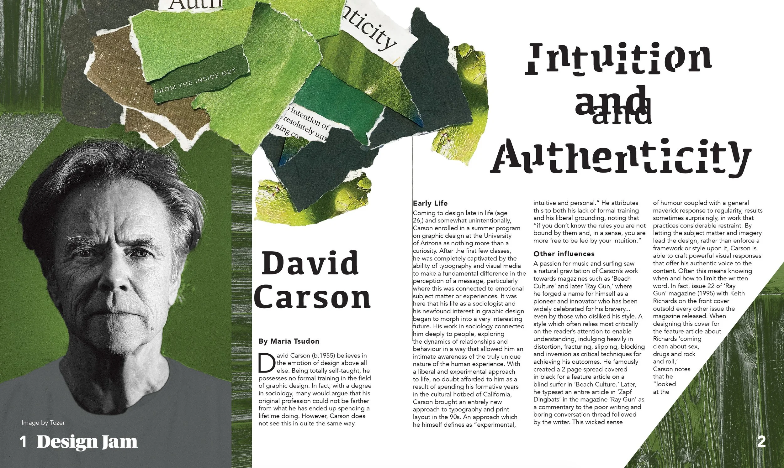
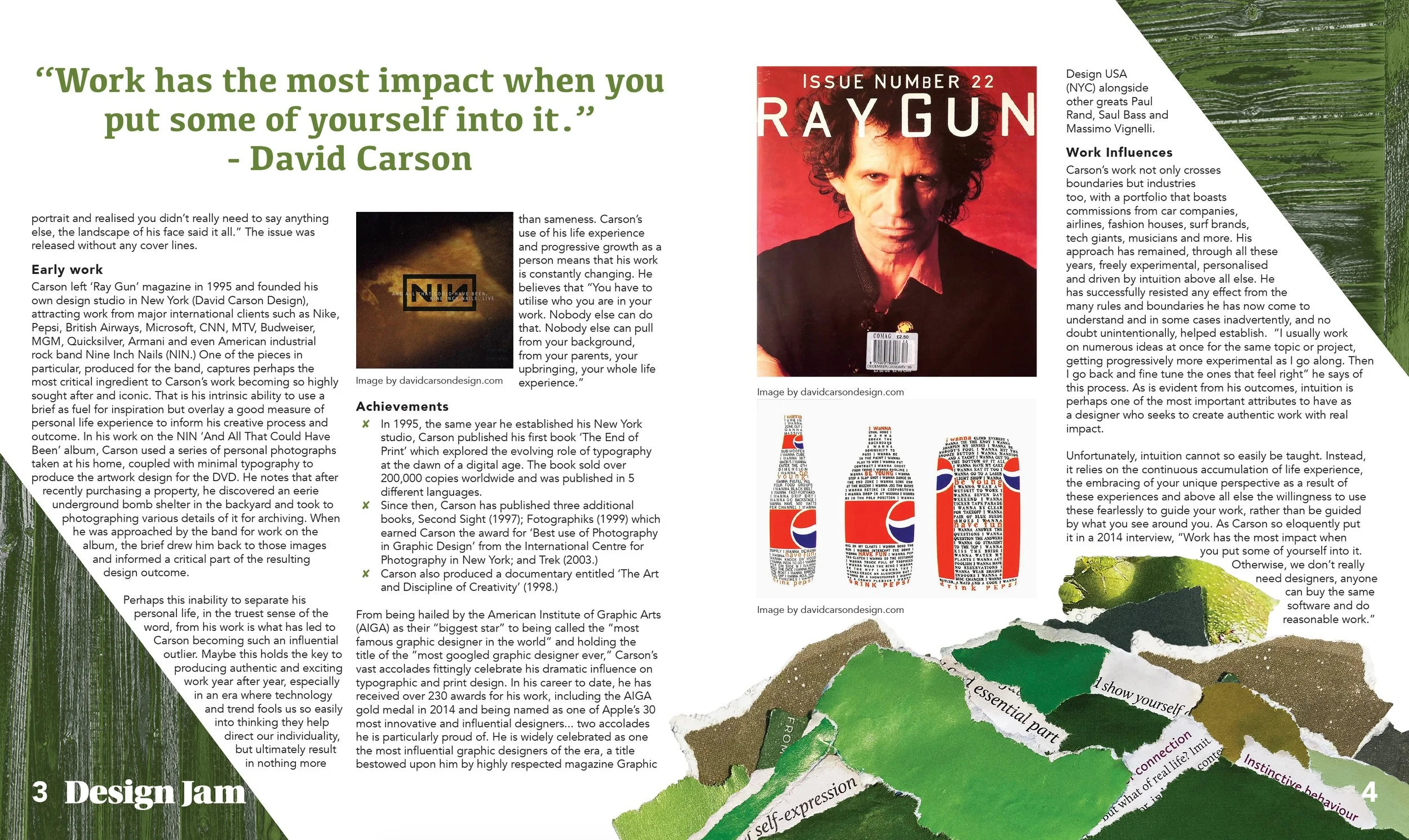
This project was created in response to a brief to design a print article about a renowned graphic designer, while working within their distinctive visual style. I chose David Carson, whose experimental approach to typography, photography and composition has had a significant influence on my own design interests.
Rather than simply recreating Carson's aesthetic, I wanted to explore the intuitive process behind his work. Carson often draws from his own surroundings and experiences, allowing photography, texture and unexpected elements to influence the direction of a design. I applied this approach by photographing my backyard after several days of rain, drawn to the mossy green, weathered timber and water damaged textures. These photographs became the foundation for the colour palette and visual language of the article.
I experimented with torn paper, found typography, handmade decoupage pieces and distorted imagery, allowing the composition to develop through experimentation rather than following a rigid layout. I also discovered that Carson's approach requires knowing when to push typography and when to pull it back. Making the reader work slightly harder to navigate the page became an intentional way of creating engagement.
The final layout combines photography, texture, colour and unconventional typography to create a dark, tactile and slightly disorientating editorial experience. The project became an exercise in trusting my intuition and understanding that experimentation doesn't always mean knowing the final outcome from the beginning.